
Gnuplot Online - Scientific Data Visualization & Plotting
Scientific data deserves professional visualization. Whether you're publishing research papers, analyzing experimental results, or modeling mathematical functions, Gnuplot delivers publication-quality plots with precision that spreadsheet tools can't match.
At tools-online.app, we've built a free, browser-based Gnuplot editor that puts professional scientific plotting at your fingertips. No installation, no configuration—just write your plotting commands and see instant results.
This guide shows you how to create 2D/3D plots, customize visualizations for publications, and leverage AI to generate Gnuplot scripts automatically. Whether you're a researcher, student, engineer, or data analyst, you'll learn to create publication-ready visualizations in minutes.
Table of Contents
What is Gnuplot and Why Use It Online?
Gnuplot is a portable command-line driven graphing utility that has been the standard for scientific plotting since 1986. According to the official Gnuplot documentation, it's used extensively in academic research and cited in thousands of IEEE and ACM papers.
Unlike spreadsheet programs or drag-and-drop tools, Gnuplot uses a scripting language that provides:
- Reproducible visualizations - Scripts generate identical plots every time
- Publication-quality output - Meets standards for academic journals
- Mathematical precision - Accurate function plotting and data interpolation
- 2D and 3D capabilities - From simple line plots to complex surface visualizations
- Extensive customization - Control every aspect of your plot's appearance
Why use Gnuplot online? Our browser-based editor eliminates installation hassles while providing:
- Instant access - No software installation or configuration
- Live preview - See plots render as you write scripts
- Template library - Start with professional examples
- AI assistance - Generate scripts from natural language
- Easy export - Download SVG or PNG instantly
For researchers and scientists, Gnuplot remains the gold standard for data visualization. For a complete overview of all visualization tools, see our Online Diagram Tools Guide.
Getting Started: Gnuplot Basics
Gnuplot uses simple commands to create plots. Here's your first visualization:
set title "My First Plot"
set xlabel "X Axis"
set ylabel "Y Axis"
plot sin(x) with lines
This creates a sine wave with labeled axes. The code appears on the left side of our editor, and the rendered plot displays on the right.
Core Gnuplot Commands
Setting Up Your Plot:
set title "Plot Title"        # Main title
set xlabel "X Label"          # X-axis label
set ylabel "Y Label"          # Y-axis label
set grid                      # Add grid lines
set key top right             # Legend position
Basic Plotting:
plot sin(x)                   # Plot function
plot 'data.txt'               # Plot from file
plot sin(x), cos(x)           # Multiple functions
Styling:
plot sin(x) with lines        # Line plot
plot sin(x) with points       # Scatter plot
plot sin(x) with linespoints  # Combined
plot sin(x) linewidth 2       # Thicker lines
Ranges:
set xrange [-10:10]           # X-axis limits
set yrange [-2:2]             # Y-axis limits
set autoscale                 # Automatic scaling
The Gnuplot manual provides comprehensive documentation for all commands and options.
Ready-to-Use Gnuplot Templates
The Gnuplot editor on tools-online.app includes pre-built templates for common workflows.Start with these professional templates - click any link to open the live editor with code and preview:
1. Functions: sin(x) & cos(x)
Compare mathematical functions with labeled curves. Perfect for teaching calculus or demonstrating wave patterns.
2. Parametric Circle
Parametric plotting demonstration showing x(t) and y(t) equations creating circular shapes.
3. Polar Plot (Rose Curve)
Beautiful rose curves in polar coordinates. Ideal for demonstrating polar plotting capabilities.
4. Histogram (inline data)
Bar chart with inline data. Use for comparing categories or showing distributions.
5. Scatter Plot (inline data)
Point plot showing data distribution. Perfect for experimental data or statistical analysis.
6. Scatter with Error Bars
Data points with uncertainty ranges. Essential for scientific research and experimental data.
7. Multiple Axes
Two Y-axes for comparing different scales. Useful when plotting datasets with different units.
8. 3D Surface: sin(x)*cos(y)
Three-dimensional surface visualization. Demonstrates 3D plotting with mathematical functions.
9. 3D Parametric Sphere
Parametric 3D sphere with x(u,v), y(u,v), z(u,v) equations. Shows advanced 3D capabilities.
10. 3D Helix
Spiral helix in 3D space. Beautiful example of parametric curves in three dimensions.
11. Heatmap (PM3D Map)
Color-coded data visualization. Perfect for showing relationships in multi-dimensional data.
12. Contour Map
Topographic-style contour lines. Shows elevation or data density patterns clearly.
13. Multiplot: Sine & Cosine
Multiple plots in one figure. Useful for comparing related datasets or showing different views.
14. Log Scale Example
Logarithmic scale visualization. Essential for data spanning multiple orders of magnitude.
Plot Types and Use Cases
Gnuplot excels at different visualization types, each suited for specific data analysis needs:
Line Plots - Time Series and Trends
Best for: Stock prices, temperature data, performance metrics over time
set title "Temperature Trends"
set xlabel "Time (hours)"
set ylabel "Temperature (°C)"
plot 'temperature.dat' with lines linewidth 2
Line plots show continuous data changes, making them ideal for tracking trends in scientific experiments, financial data, or system performance monitoring.
Scatter Plots - Correlations and Distributions
Best for: Experimental measurements, correlation analysis, statistical distributions
set title "Data Distribution"
plot 'measurements.dat' with points pointtype 7
According to statistical visualization best practices, scatter plots reveal relationships between variables that might not be obvious in tabular data.
Bar Charts and Histograms - Categorical Comparisons
Best for: Survey results, frequency distributions, comparative analysis
set style fill solid
set boxwidth 0.8
plot 'data.txt' using 1:2 with boxes
Use histograms when comparing discrete categories or showing frequency distributions in research data.
Parametric Plots - Mathematical Modeling
Best for: Physics simulations, mathematical functions, trajectory analysis
set parametric
plot cos(t), sin(t)
Parametric plots separate x and y as functions of a third variable, essential for modeling physical phenomena like projectile motion or orbital mechanics.
Error Bar Plots - Scientific Uncertainty
Best for: Experimental data with measurement uncertainty, statistical analysis
plot 'data.txt' using 1:2:3 with yerrorbarsResearch papers and publications require error bars to communicate measurement precision, as outlined in IEEE publication standards.
Combine these techniques with data from JSON or YAML sources for automated visualization pipelines.
3D Visualization with Gnuplot
Gnuplot's 3D capabilities transform complex datasets into intuitive visual forms. Use the splot command for three-dimensional plotting.
3D Surface Plots
set title "3D Surface"
splot sin(x) * cos(y)Surface plots visualize functions of two variables z = f(x,y), showing how values change across a 2D domain. Essential for mathematical modeling and physics simulations.
3D Parametric Plots
set parametric
splot cos(u)*cos(v), cos(u)*sin(v), sin(u)Create complex 3D shapes like spheres, toruses, or helixes using parametric equations. The 3D helix template demonstrates this technique beautifully.
Heatmaps and Contour Maps
set pm3d map
splot 'data.txt' matrixHeatmaps use color to represent data intensity, perfect for showing patterns in large datasets. Contour maps show lines of equal value, like topographic elevation maps.
3D Customization Options
set view 60, 30              # Rotation angles
set hidden3d                 # Hide back surfaces
set isosamples 50            # Resolution
set contour base             # Add contour lines
These controls let you adjust perspective, improve visual clarity, and create publication-ready 3D visualizations.
AI-Powered Gnuplot Script Generation
Writing Gnuplot scripts for complex visualizations can be time-consuming. Our AI Diagram Assistant generates complete plotting scripts from natural language descriptions.
How to Use AI for Gnuplot Scripts
Step 1: Configure AI (one-time setup)
- Get your API key from AIML API
- Click "Settings" icon(located lower left) in any tools-online.app tool.
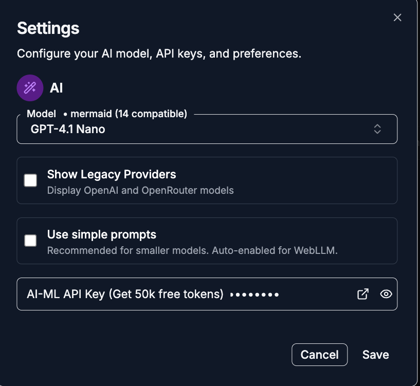
- Add API key and save.
.png)
Step 2: Open AI Chat
- Click the AI Chat button(located lower left)
.png)
- Choose "Generate" mode and provide a natural language description for the diagram.
.png)
Step 3: Describe Your Visualization
Example Prompts:
Mathematical Functions:
- "Plot sin(x), cos(x), and tan(x) from -π to π"
- "Create a 3D surface showing z = x² + y²"
- "Generate a parametric plot of a spiral"
Data Visualization:
- "Make a scatter plot with error bars for experimental data"
- "Create a histogram with 10 bins"
- "Plot multiple datasets on the same graph with a legend"
Scientific Analysis:
- "Generate a log-scale plot for exponential growth data"
- "Create a heatmap showing temperature distribution"
- "Make a contour map with 15 levels"
3D Visualizations:
- "Plot a 3D sphere using parametric equations"
- "Create a surface plot of sin(x)*cos(y)"
- "Generate a 3D helix with 5 turns"
The AI creates complete, runnable Gnuplot scripts that you can immediately render, customize, and export.
For comprehensive AI integration guidance, see our AI Integration Guide and learn how AI enhances scientific visualization.
Gnuplot vs Other Visualization Tools
Different visualization needs require different tools. Here's when to choose Gnuplot:
Use Gnuplot when you need:
- Publication-quality scientific plots
- Mathematical function visualization
- 2D and 3D data plotting
- Reproducible, script-based visualizations
- Precise control over every plot element
- Plots for academic papers (IEEE, ACM, Nature formats)
Use Mermaid when you need:
- Documentation diagrams
- Flowcharts and sequence diagrams
- Quick visual documentation
- GitHub-native rendering
Use D2 when you need:
- System architecture diagrams
- Infrastructure visualization
- Network topology maps
- Cloud architecture (AWS, Azure, GCP)
Use GraphViz when you need:
- Network graphs and dependencies
- Organizational hierarchies
- Complex relationship visualization
- Automatic graph layout
Feature Comparison:
Feature Comparison
| Feature | Gnuplot | Mermaid | D2 | GraphViz |
| Best For | Scientific data | Documentation | Architecture | Networks |
| 2D Plotting | Excellent | Limited | No | No |
| 3D Plotting | Excellent | No | No | No |
| Mathematical Functions | Excellent | No | No | No |
| Data Charts | Excellent | Basic | No | No |
| Learning Curve | Medium | Easy | Medium | Medium |
| Publication Quality | Excellent | Good | Excellent | Excellent |
For complete tool comparisons, explore our comprehensive diagram tools guide and free diagram editors comparison.
Working with the Gnuplot Editor
Our online Gnuplot editor provides a professional environment for scientific visualization:
Key Features:
Live Preview Code changes render instantly in the preview pane. See your plots update in real-time as you modify scripts.
File Operations:
- Open from Computer - Load existing Gnuplot scripts (.gp, .plt files)
- Save Locally - Store scripts in browser storage
- Import Data - Read CSV or text data files
Export Options:
- SVG - Scalable vector graphics (publication quality)
- PNG - Raster images (presentations, reports)
- Source Code - Copy script for documentation
- Copy as Image - Quick clipboard copy
Template Library Start with 14 professional examples covering 2D plots, 3D visualizations, parametric curves, and statistical charts.
Editor Tools:
- Syntax highlighting for Gnuplot commands
- Line numbers and code formatting
- Undo/redo functionality
- Search and replace
AI Integration Generate scripts from natural language, get plotting suggestions, and debug syntax errors with AI assistance.
All processing happens client-side in your browser - your data and scripts never leave your device. Learn more about our privacy-first approach.
Best Practices for Scientific Plots
Create publication-ready visualizations by following these guidelines:
1. Choose Appropriate Plot Types Match visualization to data type. Use line plots for continuous data, scatter plots for discrete measurements, bar charts for categories.
2. Label Everything Clearly
set title "Temperature vs Time"
set xlabel "Time (hours)"
set ylabel "Temperature (°C)"
set key top right
Every axis, legend, and title should be immediately understandable without additional context.
3. Use Meaningful Ranges
set xrange [0:24]
set yrange [15:30]
Set explicit ranges to focus on relevant data regions. Automatic scaling may include unnecessary white space.
4. Include Error Bars for Experimental Data
plot 'data.txt' using 1:2:3 with yerrorbarsScientific integrity requires showing measurement uncertainty. IEEE and ACM publications mandate error representation.
5. Optimize for Publication
set terminal svg size 800,600
set output 'plot.svg'
SVG format ensures your plots remain crisp at any resolution in printed journals or digital formats.
6. Use Consistent Styling Define colors, line widths, and fonts consistently across all plots in your research. This improves professional appearance and reader comprehension.
7. Add Grid Lines for Readability
set gridGrid lines help readers extract quantitative values from your visualizations.
8. Document Your Scripts
# Plot experimental results from June 2025
# Data source: experiment_A_results.csv
plot 'data.csv' with linespoints
Comments make scripts maintainable and help collaborators understand your visualization choices.
Common Gnuplot Questions
Can I plot data from CSV files? Yes. Gnuplot reads CSV and text files. Use our JSON or YAML tools to convert data formats before plotting.
How do I create subplots? Use multiplot mode
set multiplot layout 2,1
set title "Plot 1"
plot sin(x)
set title "Plot 2"
plot cos(x)
unset multiplotHow do I change colors and line styles?
gnuplot
plot sin(x) linecolor rgb "red" linewidth 3
plot cos(x) with lines dashtype 2
Gnuplot supports RGB colors, predefined color names, and various line styles (solid, dashed, dotted).
Can I export plots for LaTeX documents? Yes. Use the epslatex terminal for seamless LaTeX integration:
set terminal epslatex
set output 'plot.tex'
How do I plot very large datasets? Gnuplot handles millions of data points efficiently. For extremely large datasets, consider:
- Using binary data formats
- Sampling data before plotting
- Using the
everymodifier to skip points
Can I animate plots? While our online editor focuses on static plots, Gnuplot supports animation through sequential frame generation. Export frames as PNG and combine externally.
How do I add custom annotations?
set label "Important Point" at 3,0.5
set arrow from 3,0.5 to 3.5,0.8
Annotations help highlight significant features in your data.
Is Gnuplot suitable for real-time data monitoring? Gnuplot can be scripted for real-time updates, but for live dashboards, consider specialized monitoring tools. Gnuplot excels at static analysis and publication graphics.
Next Steps: Master Scientific Visualization
Ready to create publication-quality plots and scientific visualizations?
Start Plotting:
- Open Gnuplot Editor - Try ready-made templates
- AI Script Generation - Generate plots from descriptions
Explore More Tools:
- Complete Diagram Tools Guide - All visualization options
- GraphViz Editor - Network and dependency graphs
- Mermaid Editor - Documentation diagrams
- D2 Editor - Architecture visualization
Data Processing:
- JSON Tool - Parse and validate JSON data
- YAML Tool - Work with YAML configuration
- Data Compare - Compare datasets
Learn More:
- Scientific Data Visualization Guide - Comprehensive visualization strategies
- AI Diagram Generation - Automate plot creation
- Browser-Based Tools Benefits - Why online tools matter
Gnuplot transforms raw data into insights through precision visualization. Whether you're publishing research, analyzing experiments, or modeling mathematical systems, our free online editor delivers professional-quality plots without installation complexity.
Questions or feedback? All tools on tools-online.app are completely free with no account required. Start creating scientific visualizations today.