
Best Free Diagram Editors 2026: Complete Guide for Beginners & Teams
Browser-based diagram editors are transforming how teams visualize ideas, offering tools that are accessible, collaborative, and secure. This guide highlights the top free options available in 2025, focusing on their features, compatibility, and use cases. Key takeaways:
- Real-time collaboration: Work with teams simultaneously, reducing delays and simplifying feedback.
- Browser compatibility: Accessible across major browsers and operating systems without installation.
- Export options: Support for formats like PDF, PNG, and SVG for seamless integration into workflows.
- Variety of diagram types: From flowcharts to UML diagrams, these tools cover diverse needs.
- Data security: Encryption and privacy controls ensure sensitive information stays protected.
For U.S. users, tools like tools-online.app stand out with localized features, including American date formats and syntax consistency. Whether you're a developer, project manager, or IT professional, these tools make diagramming more efficient and accessible.
Quick Comparison
| Tool | Free Plan Limits | Collaboration Features | Export Options | Best For | User Rating |
| tools-online.app | No document limits | Real-time sharing via links | Multiple formats | Developers (Mermaid syntax) | N/A |
| Lucidchart | 3 documents max | Real-time updates, G Suite | Limited in free plan | Professional flowcharts | 4.6/5 (2.1K reviews) |
| Draw.io | Unlimited use | Google Drive sharing | Full export options | General diagramming | 4.6/5 (766 reviews) |
| Cacoo | 6 sheets, PNG export | Real-time collaboration | PNG format only | Team wireframing | 4.7/5 (158 reviews) |
| Miro | 3 boards | Real-time cursors, comments | No high-quality PDF | Visual collaboration | 4.7/5 (1.6K reviews) |
These tools simplify workflows, enhance team communication, and support a range of professional applications like software development, network design, and project management.
5 Best Flowchart Software & Diagram Tools 2025 (Full Demo & Comparison)
What to Look for in Free Diagram Editors
Selecting the right diagram editor can make a world of difference when it comes to simplifying workflows and enhancing team communication. The features below are essential for creating accurate, shareable diagrams that meet modern project needs.
Compatibility Across Browsers and Operating Systems
A dependable diagram editor should work effortlessly across all major browsers like Chrome, Firefox, Safari, and Edge, as well as on operating systems such as Windows, macOS, and Linux. This ensures that everyone on your team, regardless of their device or platform, can access and edit diagrams without any hiccups.
By adhering to established web standards, these tools guarantee consistent performance, which is crucial for smooth collaboration.
Built-In Team Collaboration and Sharing Tools
For teams, real-time collaboration is a game-changer. The best editors allow multiple users to work on the same diagram simultaneously, with updates reflected instantly for everyone. Features like in-app chat, comments, or even video calls can make communication more seamless, eliminating the need to switch between different tools.
Sharing options should be just as flexible. Look for tools that offer shareable links, direct invites, or integrations with platforms like Slack or Microsoft Teams. These capabilities make it easier for stakeholders to review and contribute to diagrams without additional software or unnecessary delays.
Support for Various Diagram Types
A versatile editor should cater to a variety of diagram needs, including flowcharts, UML diagrams, network diagrams, and organizational charts. This flexibility allows teams to tackle diverse projects, documenting everything from workflows to complex systems, all within one tool.
The ability to handle multiple diagram types also ensures smoother workflows when exporting or integrating diagrams into other platforms.
Export and Integration Capabilities
Exporting diagrams in formats like PDF, PNG, or SVG is essential for sharing and embedding them into reports, presentations, or other documents. Additionally, integration with cloud storage services such as Google Drive, Dropbox, or OneDrive ensures your diagrams are always accessible and securely stored.
These features, combined with robust security measures, allow for easy access and safe storage of your work across devices.
Prioritizing Data Security and Privacy
When dealing with sensitive information or proprietary designs, security is non-negotiable. A browser-based editor should employ encryption and secure storage to protect your data. Tools with clear data handling policies and options for data residency are especially important for organizations with specific compliance needs.
Privacy controls should allow you to manage who can view or edit your diagrams, from private access to team-wide sharing with defined permissions. Features like user authentication and access management ensure that only authorized individuals can interact with your work, keeping sensitive data safe.
tools-online.app Diagram Editor Overview
tools-online.app offers a browser-based diagram editor designed specifically for developers and teams. With no need for software downloads or installations, it provides professional-grade tools directly online, making it a convenient choice for collaborative projects.
Key Features and Tools
The editor stands out by utilizing Mermaid syntax, allowing users to create flowcharts, sequence diagrams, class diagrams, and state diagrams with straightforward text commands. This approach simplifies the process for developers familiar with coding-like environments.
An AI-powered notepad further enhances productivity by seamlessly integrating brainstorming and planning into diagram creation. The platform also supports UML diagrams, database schemas, and system architecture layouts, ensuring compatibility with various development workflows.
These tools are crafted to deliver a user experience that balances simplicity with powerful functionality.
Seamless Access and Collaboration
One of the platform's biggest strengths is its no-installation requirement. Users can open the diagram editor directly in any web browser, skipping the delays associated with installations or setup processes. This immediate access is particularly beneficial for teams working across different systems and devices.
Additionally, the browser-based design makes sharing diagrams effortless. Team members can simply share links, enabling real-time feedback and collaboration without requiring specialized software. This streamlined process improves team communication and accelerates project reviews.
Tailored for U.S. Users
tools-online.app pays close attention to U.S. standards, using the MM/DD/YYYY date format, periods as decimal points, commas for thousands, and American English throughout the platform. This localization ensures a smoother experience for U.S.-based teams, reducing the chances of miscommunication in professional settings.
The platform's text-based diagramming approach also ensures syntax remains uniform, making it easy for U.S. teams to collaborate effectively with international partners while maintaining consistency across projects.
Free Browser-Based Diagram Editor Comparison
Choosing the right free diagram editor can make a big difference in your workflow. Each platform offers its own set of strengths and limitations, which can impact how effectively you collaborate and create.
Feature Comparison Table
| Tool | Free Plan Limits | Collaboration Features | Export Options | Best For | User Rating |
| tools-online.app | No document limits | Real-time sharing via links | Multiple formats | Developers using Mermaid syntax | N/A |
| Lucidchart | 3 documents max [4] | Real-time updates, G Suite integration [8] | Limited in free plan | Professional flowcharts | 4.6/5 (2.1K reviews) [8] |
| Draw.io | Unlimited use [5] | Google Drive sharing [9] | Full export capabilities | General diagramming | 4.6/5 (766 reviews) [7] |
| Cacoo | 6 sheets, PNG export only [10] | Real-time collaboration | PNG format only on free plan | Team wireframing | 4.7/5 (158 reviews) [7] |
| Miro | 3 boards [10] | Real-time cursors, comments [8] | No high-quality PDF export [5] | Visual collaboration | 4.7/5 (1.6K reviews) [8] |
Let's dive deeper into these features to see how they align with different workflow needs.
When it comes to free plan offerings, Draw.io stands out with its unlimited document creation, making it a great choice for users who need to create diagrams frequently without worrying about limits. On the other hand, Lucidchart restricts users to just three documents, which might feel limiting for heavy users, despite 91% of its users recommending the platform [6].
"With LucidChart we can work collaboratively, more than one member on a single file at the same time and visualize the changes as they happen. We can also take advantage of other integrations such as MS TEAMS that support collaborative work." - Marianela Fernandez, Water Treatment Consultant [8]
Export options also play a big role in choosing the right tool. For instance, Draw.io provides full export capabilities even on its free plan, making it suitable for professional presentations. In contrast, Cacoo restricts users to PNG exports, which can be a challenge if high-resolution or vector graphics are needed for polished presentations.
Looking at user reviews, Cacoo leads with a 4.7/5 rating, reflecting its strong collaboration features and template library [7]. However, some users note that the limitations of its free plan can become a hurdle for extended use [6].
For teams based in the U.S., tools-online.app offers a distinct advantage. Its consistent use of American English and standardized syntax can simplify collaboration with international partners, reducing potential confusion caused by regional formatting differences.
Another emerging trend is the integration of AI into diagram editors. Some platforms now offer AI-assisted diagram creation, which can significantly speed up the initial process of building diagrams. However, the availability of this feature varies across free plans [5].
Choosing the Right Diagram Type
Different diagrams serve different purposes. Match your tool to what you're communicating:
Flowcharts - Processes and Workflows
Use when: Documenting step-by-step processes, decision trees, algorithms, or business workflows.
Best tool: Mermaid - Simple syntax, GitHub-native, 5-minute learning curve.
Architecture Diagrams - System Design
Use when: Designing software systems, cloud infrastructure, or microservices.
Best tool: D2 - Professional styling, precise control, modern aesthetics.
Network Diagrams - Infrastructure and Dependencies
Use when: Mapping networks, visualizing dependencies, showing organizational hierarchies.
Best tool: GraphViz - Handles complexity, automatic layouts, mathematical precision.
Data Visualizations - Charts and Plots
Use when: Presenting research data, performance metrics, statistical analysis.
Best tool: Gnuplot - Publication-quality, 2D/3D plotting, scientific standard.
Still unsure? Start with flowcharts using Mermaid—they're the most versatile and easiest to learn.
Getting Started: Your First Diagram in 5 Minutes
Let's create a simple flowchart from scratch. This demonstrates the basic workflow you'll use for any diagram type.
Step 1: Open the Editor
Navigate to tools-online.app/tools/mermaid. You'll see a code editor on the left and a live preview on the right.
Step 2: Write Simple Code
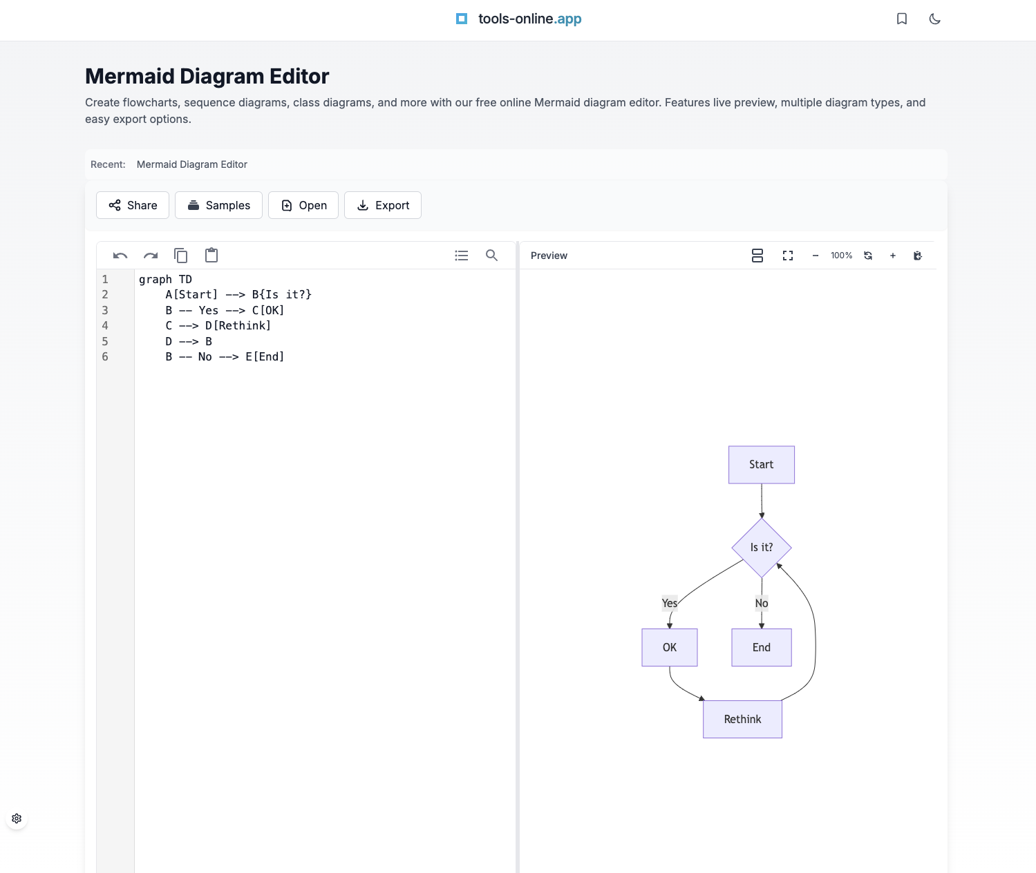
Delete any existing code and type:
graph TD
    A[Start] --> B[Process]
    B --> C[End]
Step 3: See Instant Results
The right panel updates immediately, showing three connected boxes forming a top-to-bottom flow.
Step 4: Customize
Modify the code to add decisions and labels:
graph TD
    A[Start Process] --> B{Decision Point}
    B -->|Yes| C[Action 1]
    B -->|No| D[Action 2]
    C --> E[Complete]
    D --> E
Notice how {Decision Point} creates a diamond shape, and |Yes| adds labels to arrows.
Step 5: Export
Click "Export" and choose SVG (scalable, best for documents), PNG (universal compatibility), or Copy (quick paste into emails or chat).
This same pattern applies to all diagram types—write code, see preview, export.
Common Uses for Diagram Editors
Diagram editors are versatile tools that help professionals across various fields visualize complex ideas and improve communication. They simplify intricate concepts and enhance collaboration, making them indispensable in many workflows. Let's explore their most common applications.
Creating Flowcharts
Flowcharts turn complicated processes into straightforward, visual sequences. These diagrams allow teams to better understand workflows, identify potential bottlenecks, and improve overall efficiency. For instance, workflow diagrams offer a comprehensive view of how individual tasks fit into the bigger picture, which is particularly useful for onboarding new team members or managing projects effectively [16].
"A visual representation of processes helps you analyze and visualize problems fast and bring clarity to specific tasks and responsibilities." - Andreas Lindenberg, UX CSAT specialist for MISUMI Europa [15]
To create a flowchart, define the process, break it into sequential steps, and transform those steps into a visual diagram. Sharing it with the team for feedback ensures clarity and collaboration.
Flowcharts also play a key role in decision-making. Influence diagrams, a specialized type of flowchart, highlight the relationships between different factors, helping teams communicate more effectively and reduce risks by addressing uncertainties [17]. Similarly, technical teams often use diagrams to map out system structures with precision.
UML Diagrams for Software Development
For software development teams, UML (Unified Modeling Language) diagrams are essential tools for planning and visualizing system architecture. These diagrams clarify intricate system relationships, making it easier to plan the architecture and provide stakeholders with the information they need to make informed decisions [12]. By offering a clear visual framework, UML diagrams enhance team understanding, streamline planning for future improvements, and help identify potential issues early on [11].
"Programming without an overall architecture or design in mind is like exploring a cave with only a flashlight: You don't know where you've been, you don't know where you're going, and you don't know quite where you are." - Danny Thorpe [14]
Beyond initial planning, UML diagrams foster collaboration, simplify development processes, and support better decision-making throughout a project's lifecycle. Research even suggests that using UML diagrams can lead to higher-quality outcomes by maintaining consistency and avoiding common design pitfalls [13].
While UML diagrams are crucial for software architecture, network diagrams address the challenges of technical infrastructure.
Network Infrastructure Design
IT professionals and network administrators rely on diagram editors to design, document, and maintain network infrastructure. These tools are invaluable for planning network expansions, troubleshooting issues, and ensuring compliance with security standards. As networks become more complex, diagrams provide a clear picture of current configurations, support upgrade planning, and help communicate technical details to non-technical stakeholders. They also serve as living documents, evolving alongside the network and acting as a reliable reference for maintenance and troubleshooting.
Security planning benefits greatly from network diagrams as well. By visually mapping out network components and their relationships, teams can quickly identify vulnerabilities and develop effective countermeasures. This approach often reveals gaps that might go unnoticed in text-based documentation. To ensure ongoing success, it's essential to keep these diagrams accurate and updated as network configurations change.
When creating network diagrams, simplicity is key to conveying technical details effectively.
How to Get More from Free Diagram Editors
Even the best free diagram editors can feel overwhelming when tackling complex projects. By leveraging key features, you can streamline your workflow and create polished, professional diagrams with ease.
Managing Complex Diagrams
Handling large, intricate diagrams can quickly become chaotic without proper organization. Features like layering and grouping are essential for keeping things manageable. Free tools such as yEd and Draw.io offer automatic layout options that tidy up messy connections and align elements neatly, saving you time and effort[1][2].
Instead of cramming everything into one massive diagram, consider breaking it down into smaller, linked sub-diagrams. This approach improves clarity and makes collaboration easier, allowing team members to focus on specific sections without feeling overwhelmed.
Using consistent color coding is another effective way to organize your diagrams. For instance, assign blue for database components, green for user interfaces, and red for security elements. This visual cue helps viewers quickly understand different parts of the diagram at a glance.
yEd stands out for its AI-driven chart creation and ability to import data directly from Excel spreadsheets. This feature simplifies the process of generating complex diagrams from existing datasets, making it a favorite among professionals[1].
Next, let's look at how templates and code-based tools can further simplify your diagramming process.
Templates and Code-Based Diagrams
Pre-designed templates are a huge time-saver, ensuring consistency across your projects. Tools like Draw.io and Lucidchart provide extensive libraries with templates for everything from flowcharts to detailed UML diagrams[1][3].
For tech-savvy teams, code-based diagramming with Mermaid syntax is a game-changer. This text-based language allows you to create diagrams using simple code blocks, making updates and version control a breeze[1]. Many development teams use Mermaid to automatically generate architecture diagrams directly from code comments, saving significant time.
Draw.io's support for Mermaid syntax takes this a step further by enabling seamless integration of diagrams with code repositories. Additionally, its ability to edit Microsoft Visio files makes it easier for teams transitioning from paid tools to maintain continuity without losing existing work[3].
Adding Diagrams to Your Workflow
Integrating diagrams into your workflow maximizes their impact. Modern free diagram editors make this easy by supporting various export formats, such as PNG, SVG, and PDF. This flexibility allows you to embed diagrams into presentations, documents, or collaborative platforms effortlessly[1][3].
Direct integrations with platforms like Google Drive, Confluence, and GitHub further streamline workflows. For example, Draw.io links directly to these tools, eliminating the need to constantly export and re-import files whenever updates are made[1][3].
Collaboration is another area where free tools shine. Real-time editing features ensure that team members stay aligned, even when working remotely. Draw.io's collaboration tools, along with its impressive 4.7/5 rating on Capterra, show that free software can rival paid options in functionality[3].
To keep your diagram library organized, establish clear naming conventions and update protocols. Version-controlled files add traceability and prevent conflicts when multiple contributors are involved.
Lastly, cloud-based storage ensures your diagrams are accessible from any device or operating system. Browser-based editors like yEd, Draw.io, and Google Drawings work seamlessly across Windows, macOS, Linux, and mobile devices, giving you the flexibility to work from anywhere[1][2].
Exporting and Sharing Your Diagrams
Once your diagram is complete, choose the right export format:
| Format | Best For | Advantages |
| SVG | Documentation, websites, technical papers | Scales infinitely, small file sizes, editable |
| PNG | Presentations, quick sharing, email | Universal compatibility, works everywhere |
| Source Code | Version control, collaboration | Git-friendly, tracks changes, text file |
Embedding in documentation: Mermaid renders natively in GitHub and GitLab markdown files, issues, and pull requests. For Notion or Confluence, export as SVG or PNG and embed as images.
Collaboration workflows: Share editor URLs with diagram code encoded for real-time review. Store diagram source code alongside documentation in your repository for version control. Use our Code Compare tool to track diagram changes over time.
All processing happens client-side in your browser—your diagrams never leave your device unless you explicitly share them.
Common Mistakes and How to Avoid Them
Overcomplicated Diagrams
Problem: Trying to show everything in one diagram creates overwhelming visuals.
Solution: Split complex systems into multiple focused diagrams. One diagram should communicate one concept clearly.
Unclear Labels
Problem: Generic labels like "Process 1" or "Service A" force viewers to guess meaning.
Solution: Use descriptive, specific labels. Instead of A --> B, write User Authentication --> Token Generation.
Wrong Tool for the Job
Problem: Using architecture tools for simple flowcharts or vice versa.
Solution: Match tool to diagram complexity: simple process → Mermaid, system design → D2, complex networks → GraphViz, data plots → Gnuplot.
Inconsistent Styling
Problem: Mixing styles, directions, or naming conventions within one diagram.
Solution: Choose one approach and stick with it throughout. Use consistent naming (all verbs or all nouns for nodes).
No Context
Problem: Diagrams without titles, legends, or explanatory text.
Solution: Always include a descriptive title, legends if using colors or shapes with specific meanings, and brief explanatory text in surrounding documentation.
Create Professional Diagrams with Free Tools
Start creating flowcharts, UML diagrams, and more with our free browser-based diagram editor. No installation required, works on any device.
Conclusion
Free diagram editors have become indispensable tools for visual communication and project management, playing a key role in how teams and industries collaborate. As the need for intuitive and efficient diagramming solutions grows, these platforms have evolved into essential productivity resources.
By 2025, features like collaboration, AI-driven design assistance, and interactive elements have become standard in many diagramming tools [5]. When selecting the right tool, it's important to consider factors like compatibility, collaboration capabilities, and data security. Browser-based options stand out for their convenience, eliminating the need for installation while ensuring accessibility across devices and operating systems.
The Mermaid Diagram Editor by tools-online.app is a prime example of this approach. Operating entirely in your browser, it ensures your data stays on your device, offering features like real-time previews, multiple export formats, and dark mode. Its focus on simplicity, speed, and security caters to professionals seeking powerful tools without unnecessary complications. With its no-install, code-friendly design, tools-online.app is well-equipped to adapt as the industry continues to evolve.
Looking ahead, diagramming software is expected to emphasize data privacy, enhanced customization, and seamless integration with productivity suites [5]. Whether you're working on process flowcharts, UML diagrams for software projects, or network architecture designs, today's free tools offer robust features that can adapt and grow alongside your needs.
FAQs
What are the advantages of using a browser-based diagram editor instead of traditional software?
Browser-based diagram editors bring several advantages compared to traditional software installations. For starters, they are accessible from any device with an internet connection. There's no need to download or install anything, making them highly portable and convenient - ideal for people who switch between devices or need to work while traveling.
Another major perk is automatic updates. With these tools, you're always using the latest version without the hassle of manual updates. Many of these editors also offer collaboration, enabling multiple users to work on the same diagram at once. This feature is especially useful for remote teams or group projects, where seamless teamwork is key.
These capabilities make browser-based diagram editors a practical and time-saving option, perfectly suited for today's fast-paced workflows.
How do free diagram editors protect sensitive data and ensure privacy?
Free diagram editors place a strong emphasis on data security and privacy, employing measures to protect your sensitive information. Many of these tools allow you to store your work locally, ensuring your data remains on your device without being uploaded to external servers. Additionally, they often incorporate encryption to protect your data, both while it's stored and during any transfers, shielding it from unauthorized access.
How do I create a diagram online for free?
Visit a free online diagram tool like tools-online.app, choose your diagram type (flowchart, architecture, network, etc.), write simple text-based code or use templates, and export as SVG or PNG. No installation or account required.
What is the easiest way to create diagrams?
Start with ready-made templates and modify them for your needs. Tools like Mermaid use simple, markdown-style syntax that you can learn in 5 minutes. For example: A --> B creates a connection between two boxes.
Do I need design skills to create diagrams?
No. Modern online diagram tools handle layout and styling automatically. You focus on content (what connects to what), and the tool creates professional-looking visuals.
Can I use AI to create diagrams?
Yes. AI-powered diagram generators let you describe what you want in plain English (e.g., "create a login flow with password reset"), and they generate the complete diagram code for you.
What diagram types can I create online?
You can create flowcharts, sequence diagrams, architecture diagrams, network topology maps, database ERDs, Gantt charts, state machines, organizational charts, and scientific data plots—all in your browser.
How do I export diagrams for presentations or documents?
Export as SVG (scalable, best for documents) or PNG (universal compatibility, best for presentations). Most tools also let you copy diagrams directly to your clipboard for quick pasting.